Animation Exercises ~ Task 2
Animated Logo:

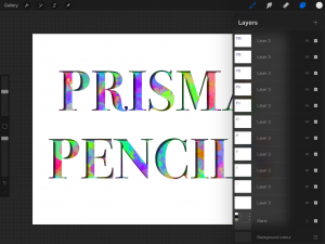
I’m not as happy with the logo as I am with my pieces for the other tasks. I had an idea for text to look like it was cut out of paper with colour underneath and I think that the idea was a good one. However, I ended up using Procreate to create this which was definitely not the most efficient tool. I would’ve liked it if the colour was moving and warping during the animation but it just wasn’t very possible to do in Procreate and I wish I had used a different piece of software. I also don’t think the letters look very cut out. I will likely try doing some more logo designs in future and update them in my gallery since I’m really unhappy with this one.
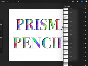
Using procreate I had to create a single layer for every frame. It was incredibly exhausting to do, and I wish I had used a different application.


No comments yet.